
Still-Life photography - Laura Letinsky

For my magazine, I decided to research different photographers  that may inspire me for my magazine cover by their methods and focuses.  

Laura Letinsky 

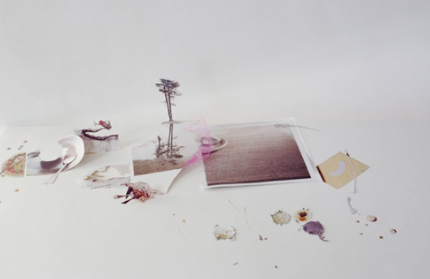
Laura Letinsky is a Canaian photographer born 1962 in Winnipeg , Canada. She is known for her still life art. She began her career with taking photos of people but late 1900s, she replaced people  with objects. She uses objects such as fruit bowls to present their beauty. She presents that nature within her photographs. 


https://thegreatdiscontent.com/interview/laura-letinsky

https://www.artsy.net/artist/laura-letinsky 

https://www.yanceyrichardson.com/artists/laura-letinsky


Comments

Popular posts from this blog

Camera composition

Camera composition is the way the audience view towards the most important parts. The flow in scenes are all a part of camera composition :  Framing  Rule of thirds  Depth of fields Deep and shallow focus  Focus pull What do the camera compositions mean and convey?  Framing : an element that provides a visible within border of the photograph/shot itself. It's a frame that provides a layer to a photograph and the story being told.  Rule of thirds: describes a basic  structure of a shot. Places key elements within a photo.                                                            Depth of fields: range of distance within which all objects will be in acceptable sharp focus. Shallow focus: emphasize one part of the image over another. Deep focus: entire image is in focus.  ...

Preliminary Contents Page


Evaluation Question 1

How does your product use or challenge conventions and how does it represent social groups or issues? Click HERE for video:  Evaluation Question 1 As I developed my magazine, I was researching many magazines I may relate to. I was inspired through many photos and magazines, which allowed me to find ideas on how my magazine may look and come out. On my cover page some, my masthead was “ The Impact” to correlate with the text. I designed my masthead with bold letters to have the “impact “ affected. I used a light brown to go with my color scheme and the background of my cover image.  I was inspired by many magazines  such as “Essence” and “Ebony” that used bold letters to attract their audience.  As I went through the processes of creating my product, my theme was “professionalism”. I want my model to have a very neat appearance and a leader demonor. Therefore, I wanted to have the office background to show the professional setting. My magazine consisted of cover lines...